I joined Openscreen as a Senior UX Designer in its early startup phase. At the time, there weren't any formal design guidelines or systems in place. So when features were added - it usually meant multiple revisions, duplicate code, varied code design patterns, and a as a user: poor user experience.
Design System
Skribbs Design System
A design system in UX refers to a comprehensive collection of reusable components, guidelines, and standards that ensure consistency and efficiency in the design and development of digital products.
Overview
Challenge
Goals
I needed to develop a design system that could serve as reference and source of truth. The goal was to create a visual language that represented the product, and a consistency across the brand.
I also needed to ensure that the design system was easy to access for the developers and product managers.
Requirements
As a result what I created needed to also:
- Build a design language (typography, brand colors, spacings, icons, and layouts).
- Create reusable and easily extendible components.
- Design every element and its variations/states.
- Provide references and exact values for the developers.
- Quickly create mockups/screens for the stakeholders
The System
The Setup
I used Brad Frost's Atomic Design Methodology for the design system and using Figma to build it. I set up Figma to mirror the dev environment we were using - React. They both used components that were reusable and extendible. I'd be able to make components at any level (atom, molecule, organism, template). With this setup, it was easy to modify and customize elements at different levels.
Tokens
I started by creating the 'Tokens'. Setting up the specific variables for typography, spacings, and colors. These would be the design systems source of truth and the basis for every component created.
- For the spacings I used an increment of 4 (pixels);
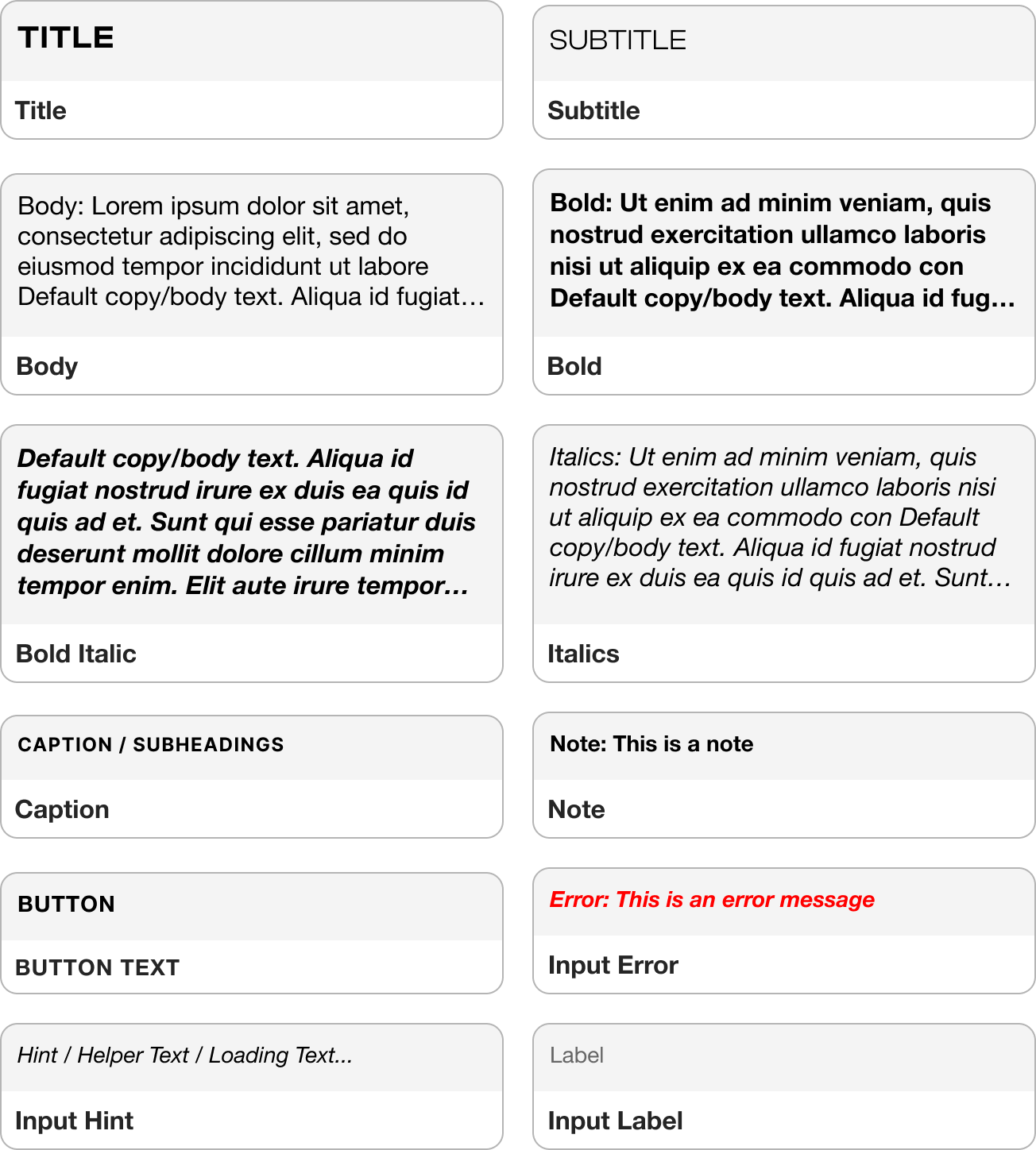
- For the font I used a perfect fourth typography scale, and set up font variables (body, headings, code, quotes, etc. ). My general rule is if its technical, try to keep the scale subtle, and if its more content heavy, make the typographic scale larger between headings
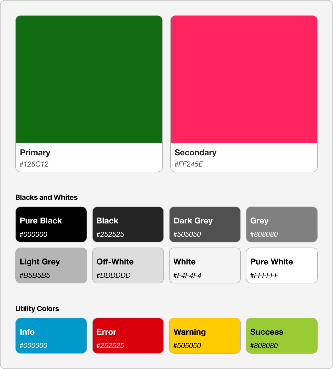
- For colors, I defined main colors, the blacks and whites and greys, and the utility colors. With this approach, I'd be able to make global changes in this one location.
Atoms
Atoms go hand-in-hand with the tokens. They're the most basic and smallest building block. This includes text elements, colors scheme, and icons.
Headings
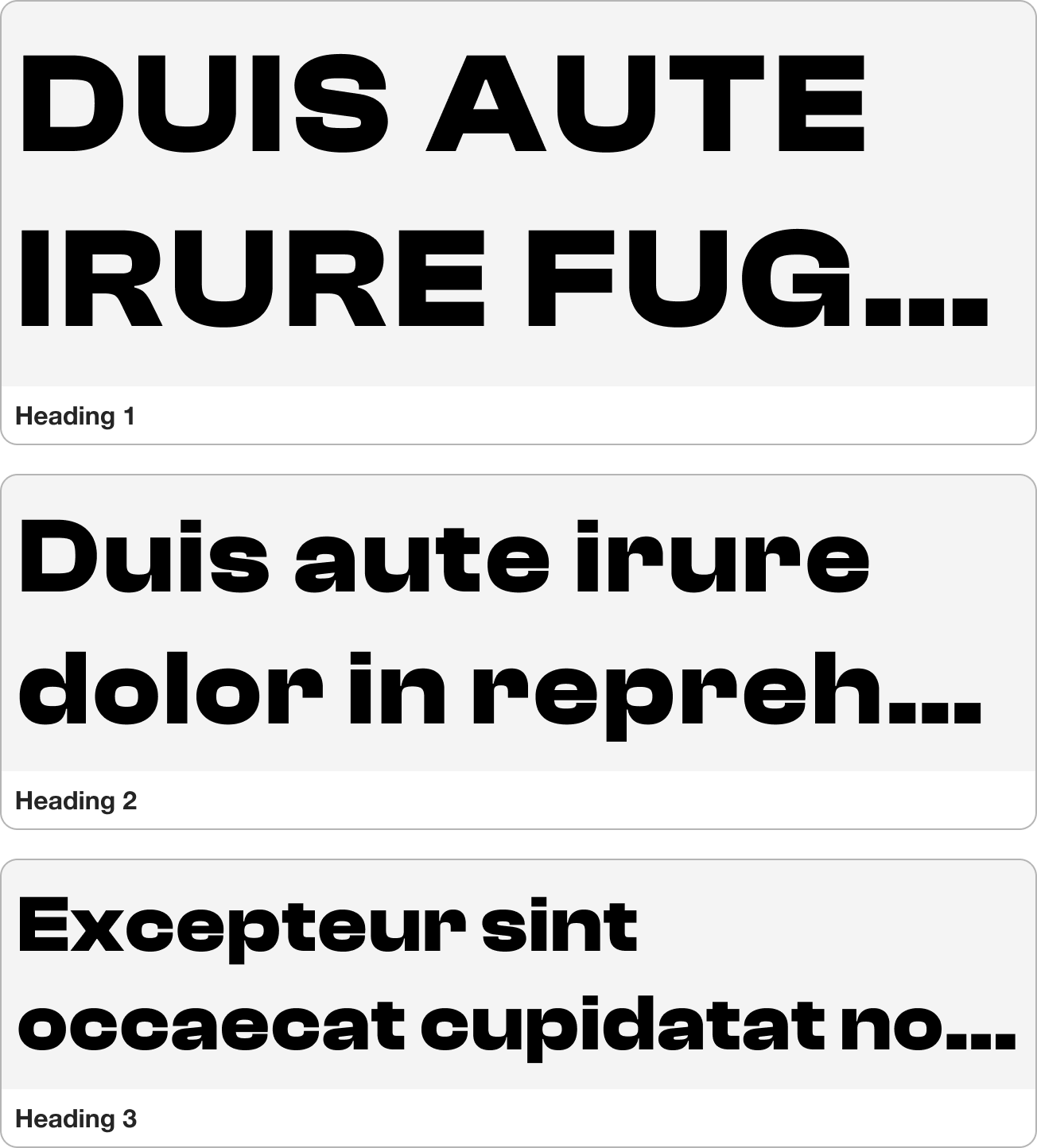
Typography
Colors
Icons
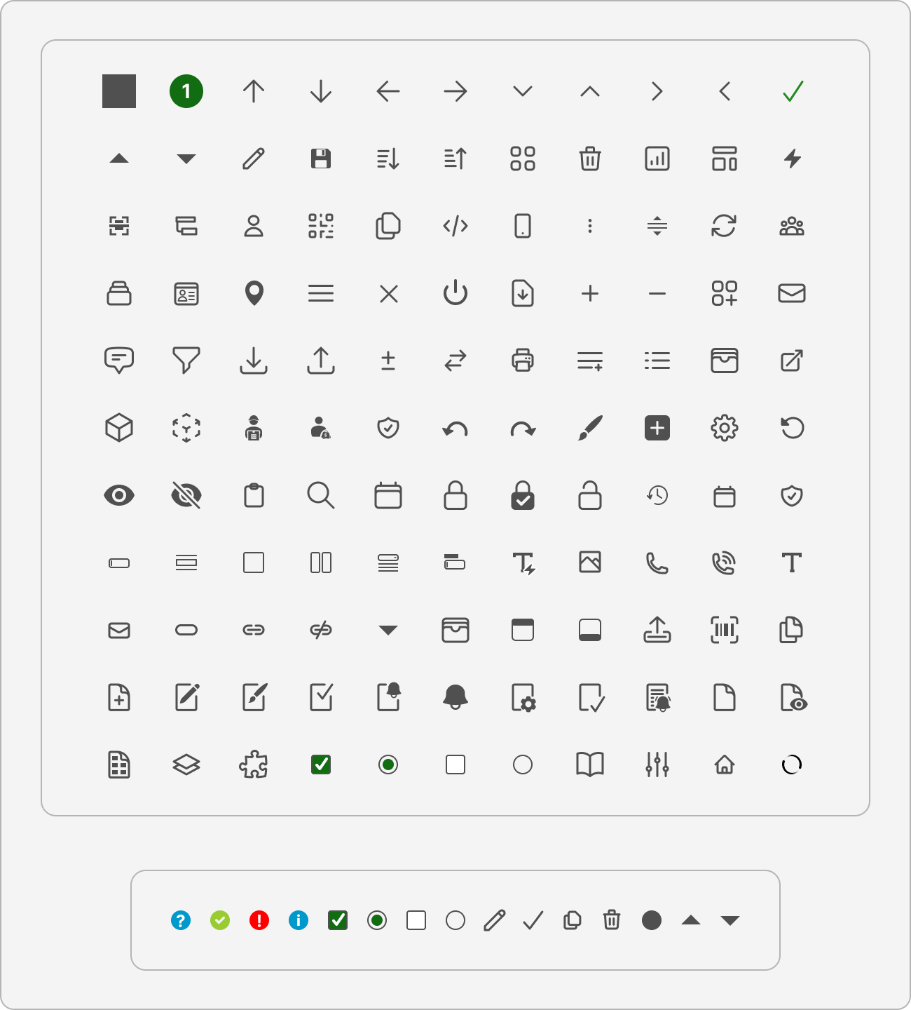
Molecules
Combining Atoms together we get Molecules. A few examples of molecules include buttons, and input fields.
Organisms
Organisms are elements that can be built with atoms and molecules. We build on the visual consistency by reusing existing elements.
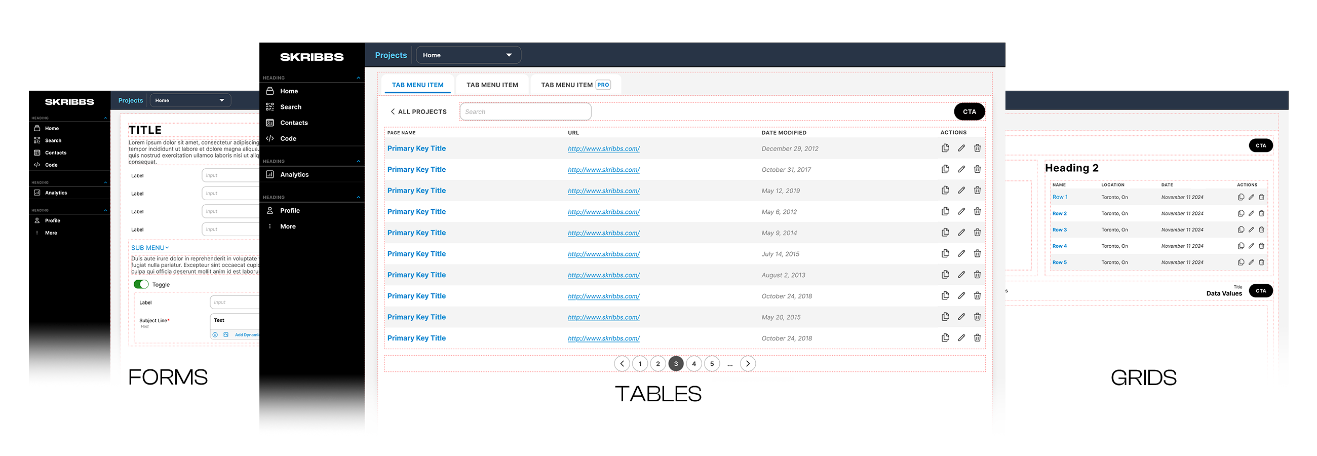
Templates
Finally we have the templates. A combination of atoms, molecules, and organisms to create the the layout and composition of a page/screen.
Results &
Conclusions
By adopting this approach, we streamlined the design and implementation process across products. We built a reusable component library, making it easy to maintain consistency and efficiency throughout development. Elements at every level — atoms, molecules, and organisms — can be easily modified at any stage.
It is easy to make any elements responsive at any level.
It was easy to translate the design to code (for the developers) with the use of the design tokens.
Additionally, Product Managers could visualize features before development began, ensuring the designs met business requirements and accelerated reviews and feedback and decrease iterations.