Many people living in the surrounding areas of the GTA face the inconvenience of commuting to downtown to get access to coop work spaces. These commutes consume time, transportation costs, and detract from work-life balance. LAUFT addresses these issues by providing workspaces to users in the surrounding GTA areas. It had been about a year with the original Lauft App (MVP) and we wanted to determine the pain-points faced by users when booking a space and location using the App.
Lauft Case Study
LAUFT connects remote workers and organizations to the spaces, tools and services that will optimize collaboration and productivity, in the most convenient, consistent and professional way possible.
Overview
Challenge
Research Goals
To understand the problems faced by users I conducted (informal) interviews with users at the Castlefield Vaultra location to determine the issues they faced. I worked with the Product team to understand the business requirements and connected with the development team determine where existing and potential users would drop off on the app, and took a look at the support tickets to see what problems the users were facing. Lastly I used the feedback to restructure the user flows and information architecture to make the user experience more intuitive.
Research
User Personas
Most of the users were very similar: professional freelancers, sole-proprieters, individuals that needed a workspace that was close to home without being home. Every now and then we'd get users that were looking for an event space to host charity drives, potlucks, dj events, meetups, and parties.
*One of the job requirements while working at Lauft was to facilitate users at various locations. I was able to conduct informal interviews and surveys with several of the users to generate the two main personas.
Persona #1
The Professional
Alex (28) recently graduated from the Digital Media program at Seneca College. He is currently living in a shared 2 bedroom apartment in Mississuaga (a suburb of the GTA) with one roommate – there is no common living space. He’s been able to land a couple freelancing projects, but he’s finding it difficult to work from home because of the limited space he has, and the distractions from his roommates.
Goals
- To access a professional space with less distractions, and like-minded people.
- To be able to rebook a location and space easily.
- To have access to professional equipment rental (monitors, webcams, meeting rooms) if needed.
Pain Points
- Difficult to find information on how to access professional equipment.
- When he books a location and forgets to load his digital wallet, he has to cancel out of all his progress to add the funds and then restart the process.
I need a studio space where I can work on my projects and separate from my home.
Persona #2
The Book Club Owner
Sarah is a 40 year old, stay at home mom (with 2 kids). She lives in a 2 bedroom apartment in Vaughan Ontario. On her downtime Sarah is passionate about reading, enjoys discovering new authors and genres, loves discussing books with others. She isn’t very tech savvy. She started a book club with other book lovers in the area, and gets together once a month to discuss the books and recommend the next reading.
Goals
- To have a reliable, central space to host regular book club meetings that is accessible.
- Flexible booking options depending on the number of members that are attending.
Pain Points
- Wishes there was a way to choose the type of space (depending on the number of attending members) before selecting the location.
- The booking process was too rigid and linear, and if your priority is the type of space vs the location, you have to do a bit of research.
I want to be able to book a space based on how many people are attending and where its close enough to everyone.
Information
Architecture
Userflows
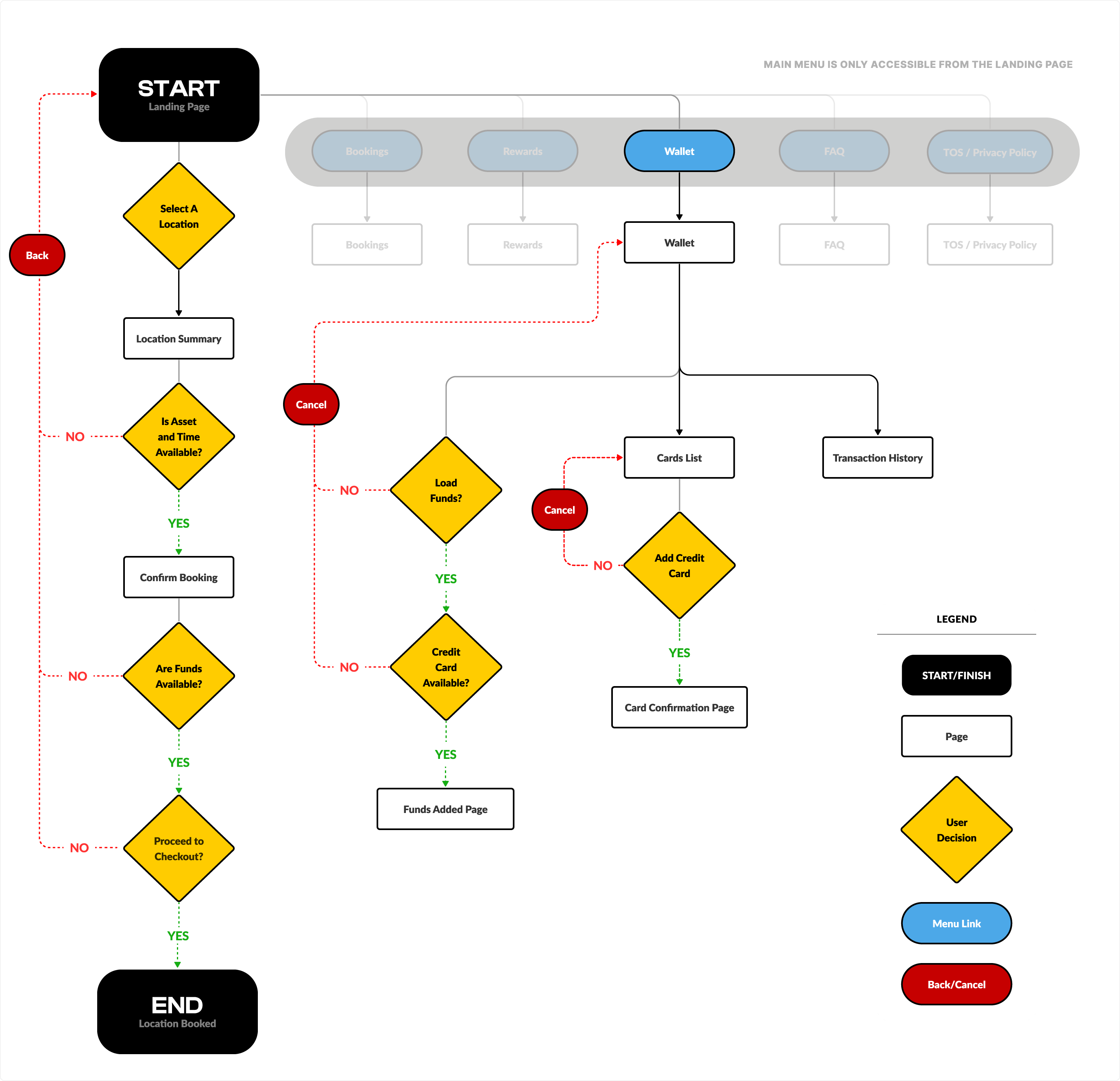
The problem with the main user flow - Select a Location > Select an Asset and Time > Confirm Booking - was that the process was too linear and if you forgot to let's say put the funds into your account, you'd have to go back to the start of the process to address it. New features and requirements were consistently added to the MVP app without considering the workflow and user's experience into account. As a result, first time users could spend almost 30 interactions just to get setup and ready.
Pain Point 1
If the location doesn't have the asset and availability, the user has to go back to the landing page and try a different location until they find one that has what they want.
Pain Point 2
If a first time user configures their booking successfully, but doesn't have any funds in their account, they have to go back to the landing page where they can access their wallet and add funds through there.
Pain Point 3
Again because of how linear the process was, if the user wanted to load funds but never added a credit card. They'd have to cancel out and go back to the wallet and start the process to add the card.

Drag the flow diagram above to see the steps it takes for the worst case scenario (~25 steps)
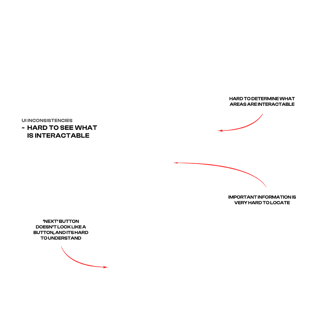
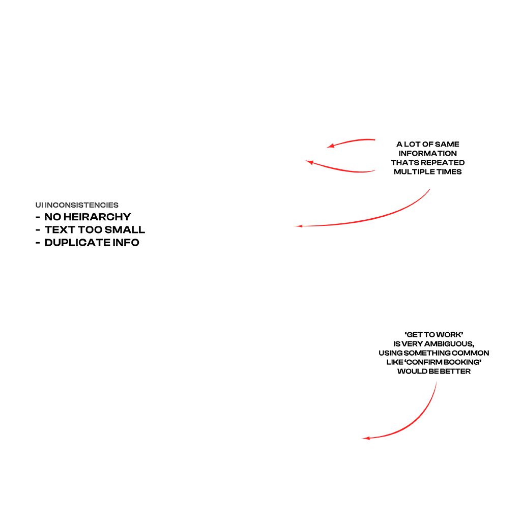
Existing UI
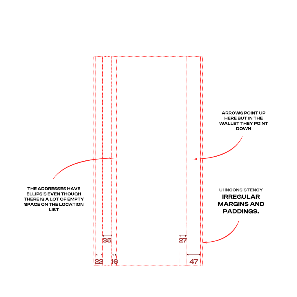
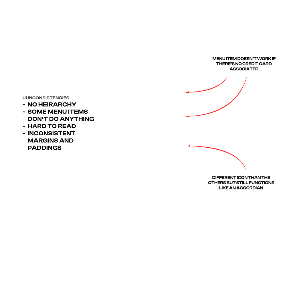
In general, there were a lot of UI inconsistencies. The icons were different sizes throughout the app, and had various stroke thicknesses. Typography didn't follow any standards. Font sizes and styles were also inconsistent and overall really small. Elements felt very crammed, and there was a lack of information heirarchy.
Home Screen
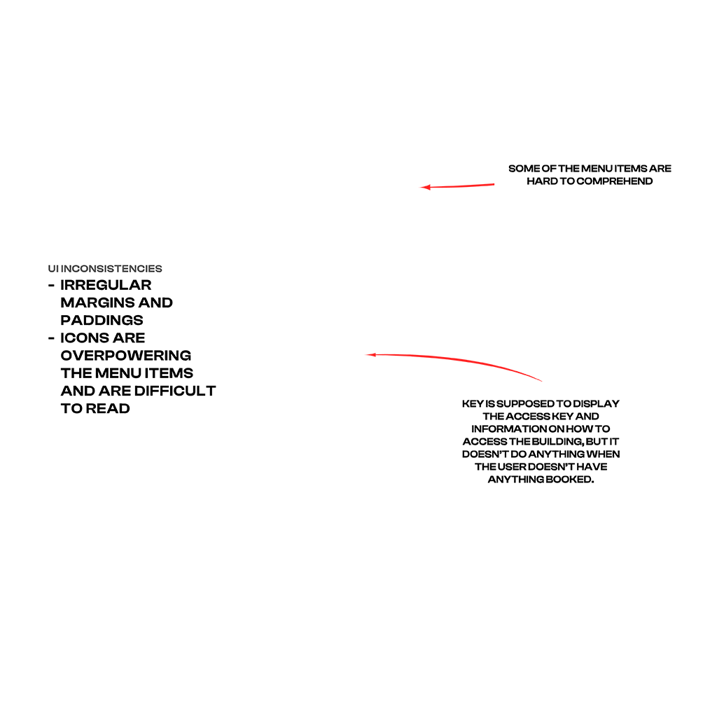
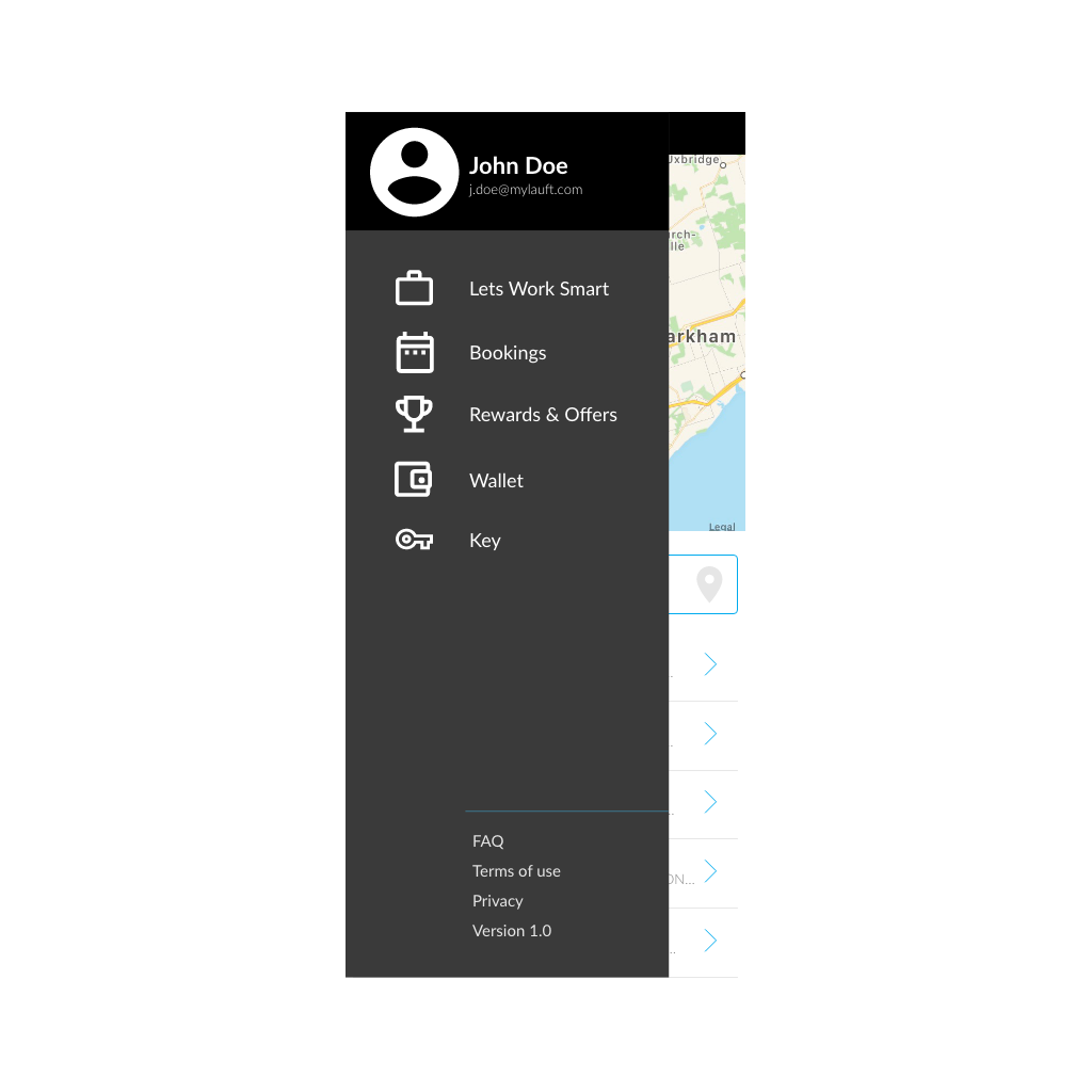
Main Menu
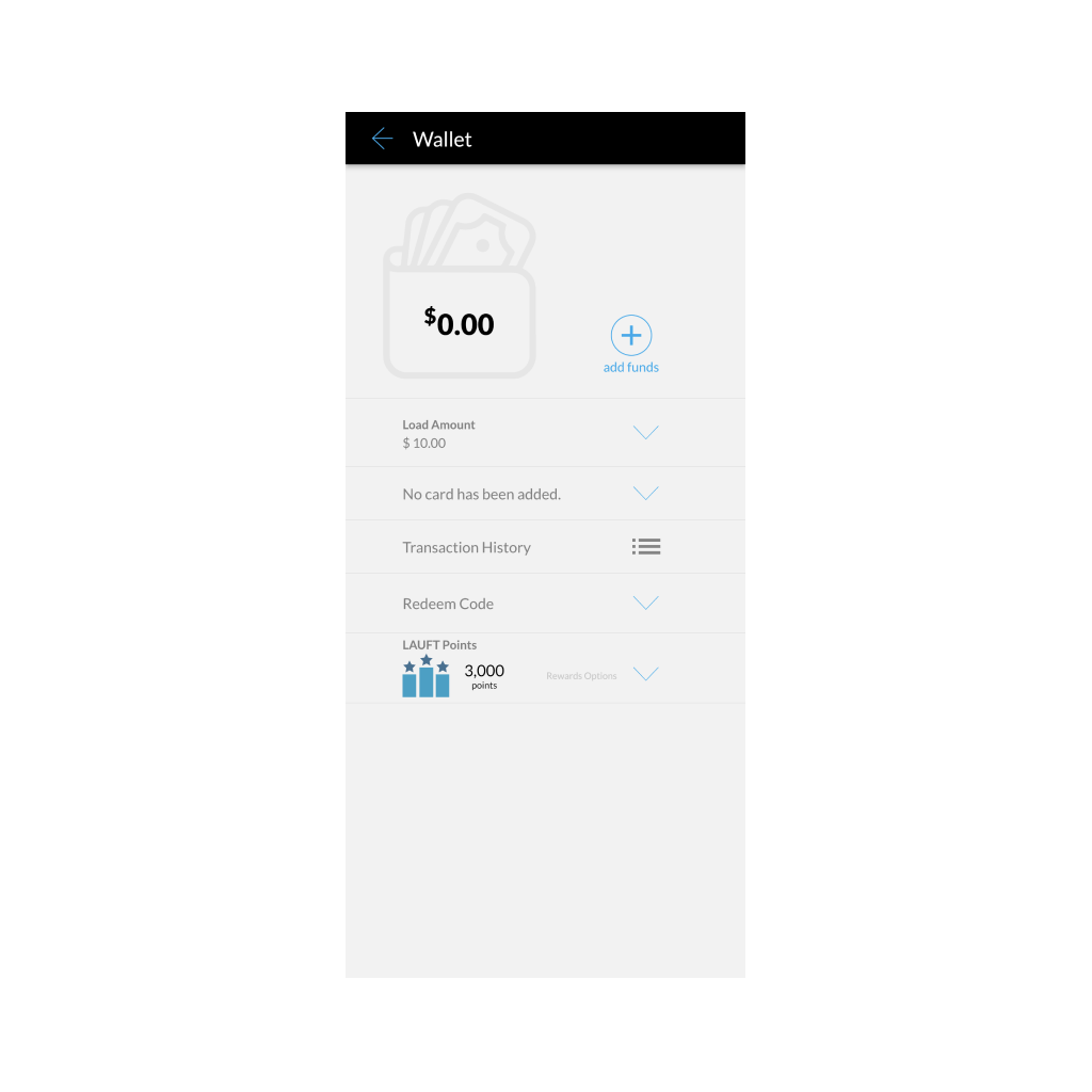
Wallet

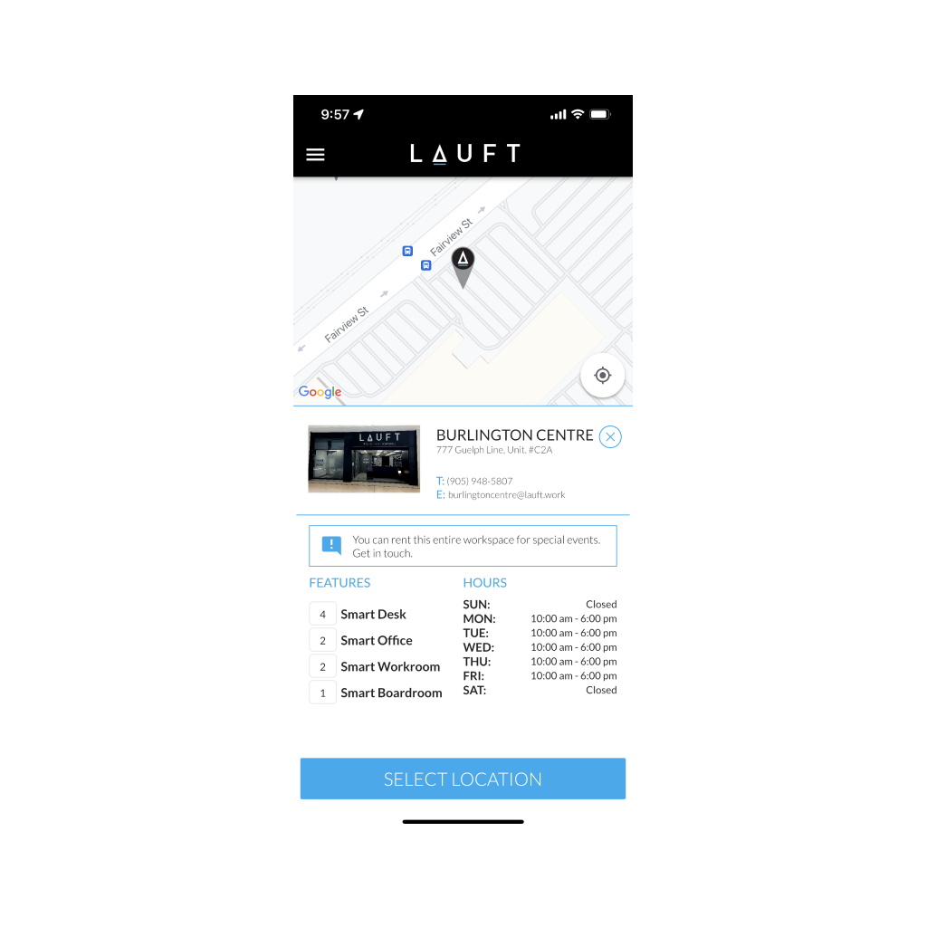
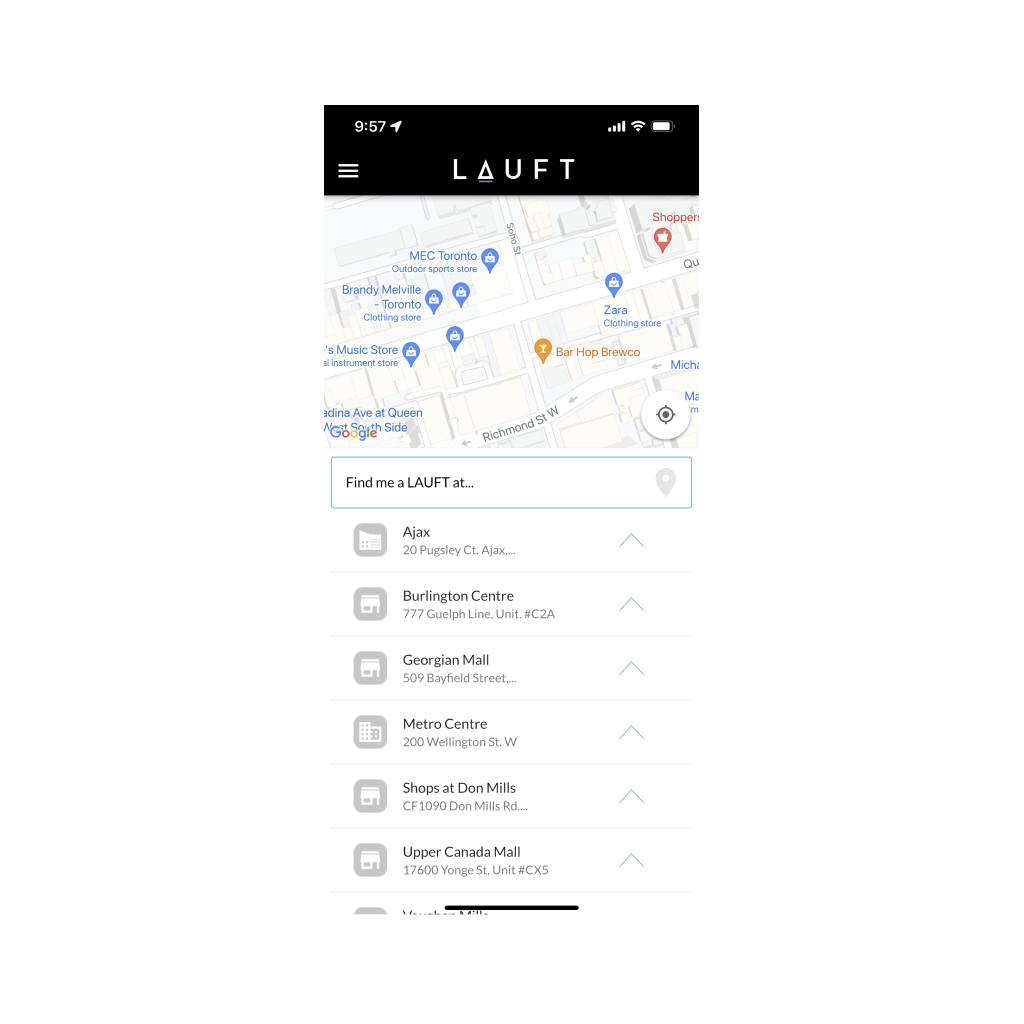
Location Selection
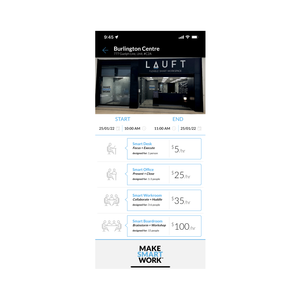
Asset + Time Selection
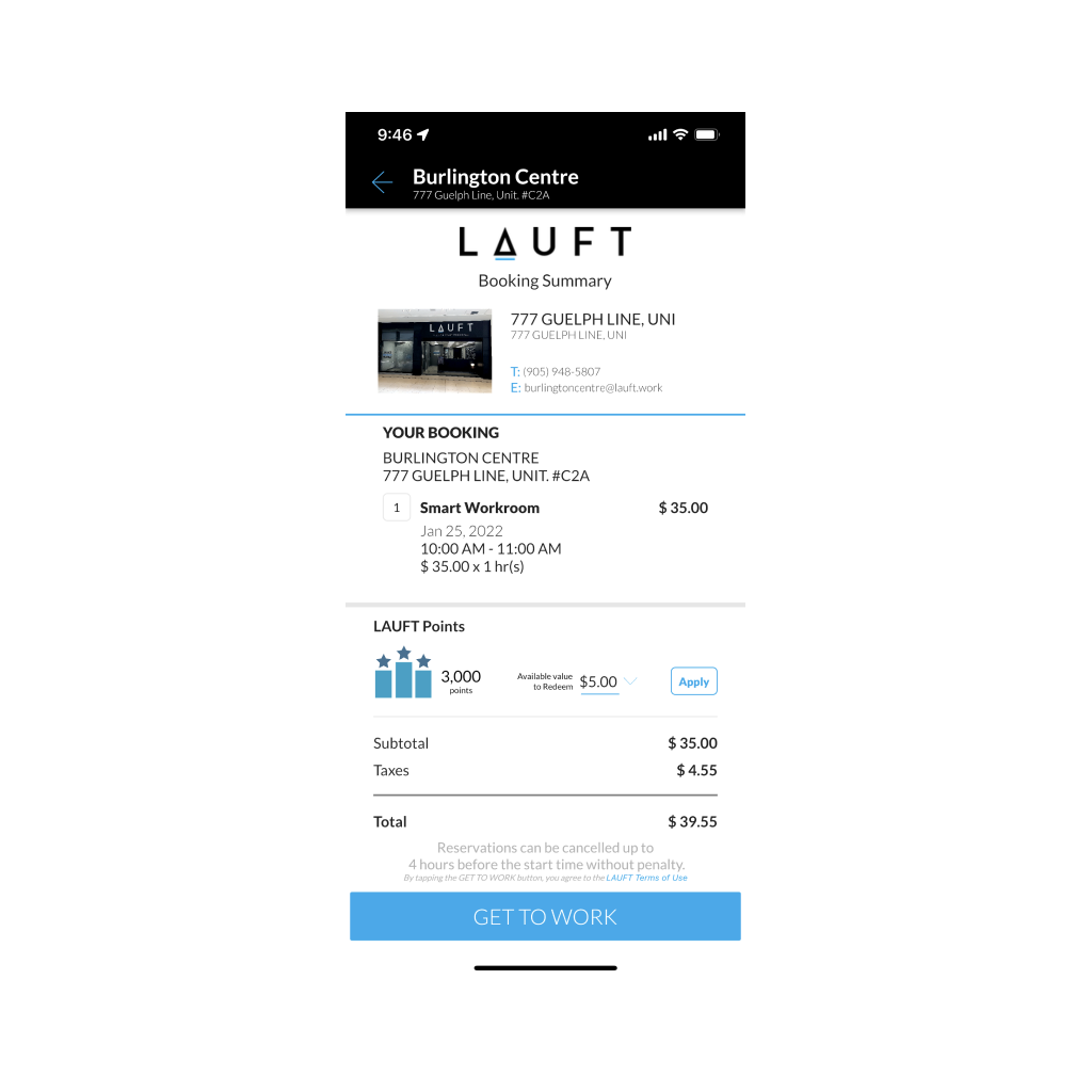
Confirmation Screen

Drag the screens above (or tap the circles) to see the issues with the live app.
Solution
Ideation
Menu Reorangization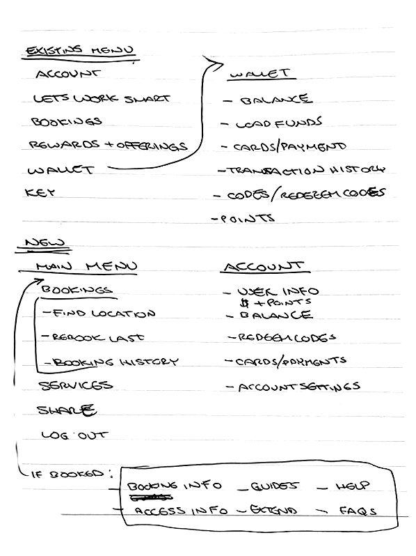
One of the major issues the users faced was having to restart the entire process because they forgot to load their wallet. To fix this I redesigned the header to always be visible on every page. I separated the menu into to two sections: The main menu which would focus on bookings; and a secondary menu that would contain the account info and wallet. Both menus slide in as shelves keeping the user in the flow.
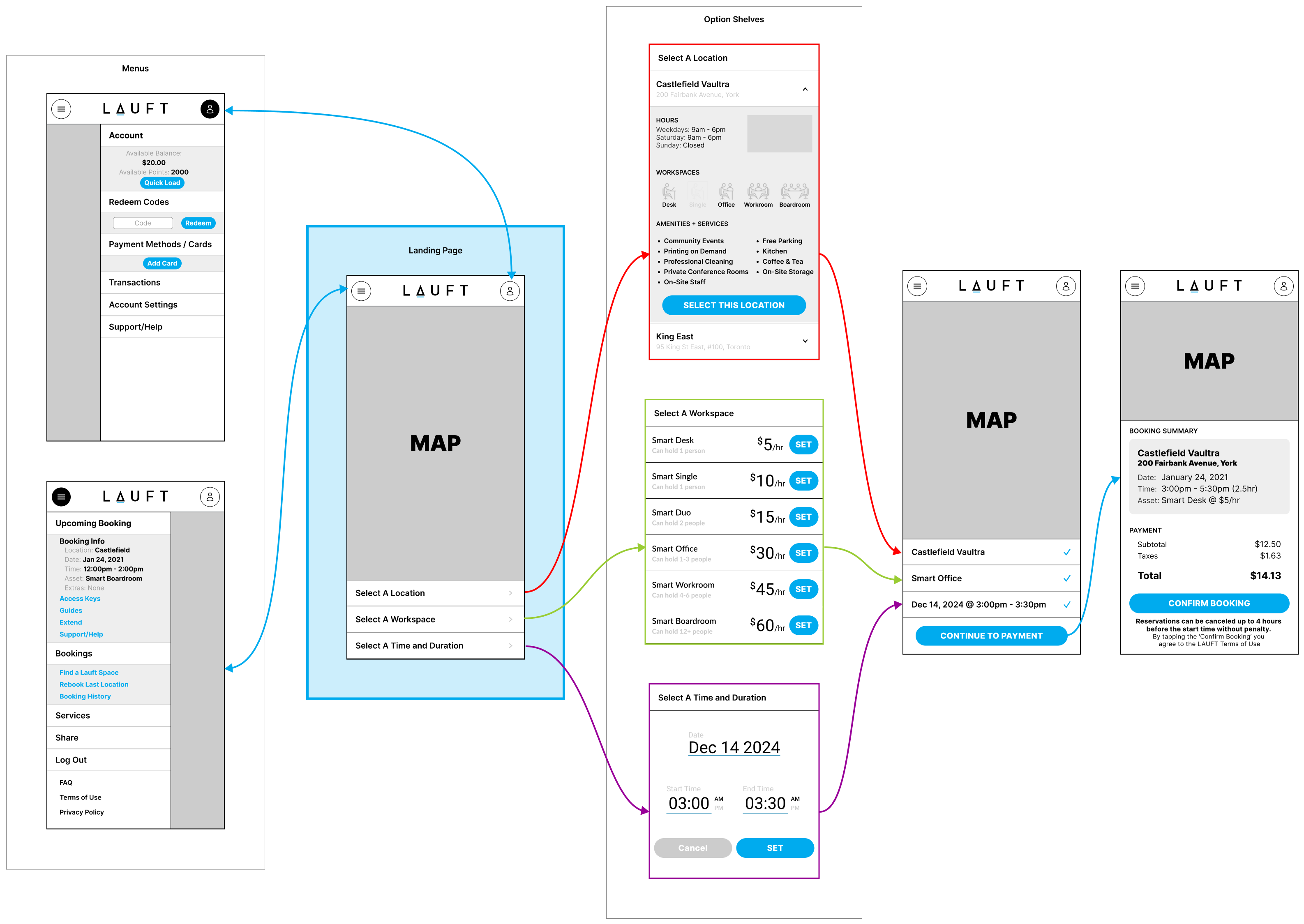
New App Flows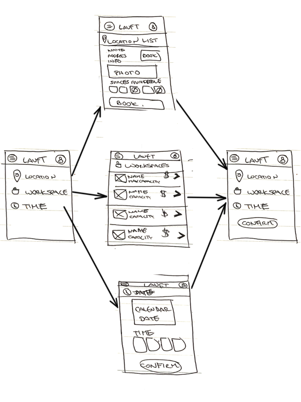
The second major painpoint the users faced was the process of booking a location was too linear. I changed the UI so that now a user could choose between choosing a location, date and time, or asset in any order. The date and time and asset selection act like filters for the locations (and on the map), and if a location didn't have an asset, or the time wasn't available the location became disabled. Once all three options were selected, a 'Confirm Booking' button appears, where the user can purchase the booking.
Lo Fidelity
Userflows
Branding
Typography

The typeface used throughout the LAUFT booking app is Lato.It is clean, legible, inviting and professional.
Colors
Primary
#00ABEE
Secondary
#0076A8
Tertiary
#FFFFFF
#E2E3E4
#9D9D9D
#383F45
#1D252C
#000000
Prototype

Results &
Conclusions
With this redesign we tackled all of the users' painpoints and restructured elements in a way that can be easily extended. Some of my key takeaways from this project are:
- Develop the MVP and do your user testing early. How you expect the users to interact might not be the way they use the product. Sometimes the way the users interact with an app may be completely different that what was intended.
- Take time to structure things and organize them in a logical way. Group similar things together, remove options that don't do anything, and arrange things by importance.
- Sometimes its better to rebuild a feature than trying to make it work with what you have. It was easy to tell that there were a few features that were added as an afterthought because they didn't really fit in. Sometimes you need to use ductape and glue to get things done, but you should always go back and fix things properly when you can.